Design series – the post
I’d say the home page is looking good enough now, let’s get to the meat of the whole thing and look at an individual post. The following elements are especially important:
- Post title
- Normal body text
- Headlines
- Links
- Blockquotes
- Images
- Code
- Tables
- Footnotes
This is what I notice:
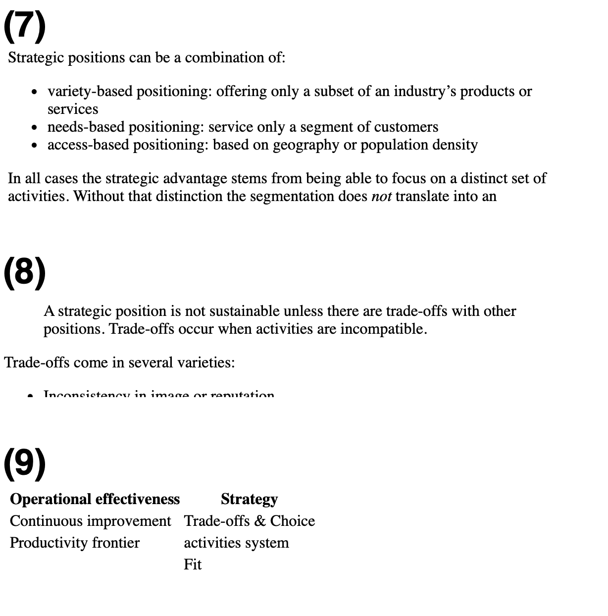
| Element | Comment | Evidence |
|---|---|---|
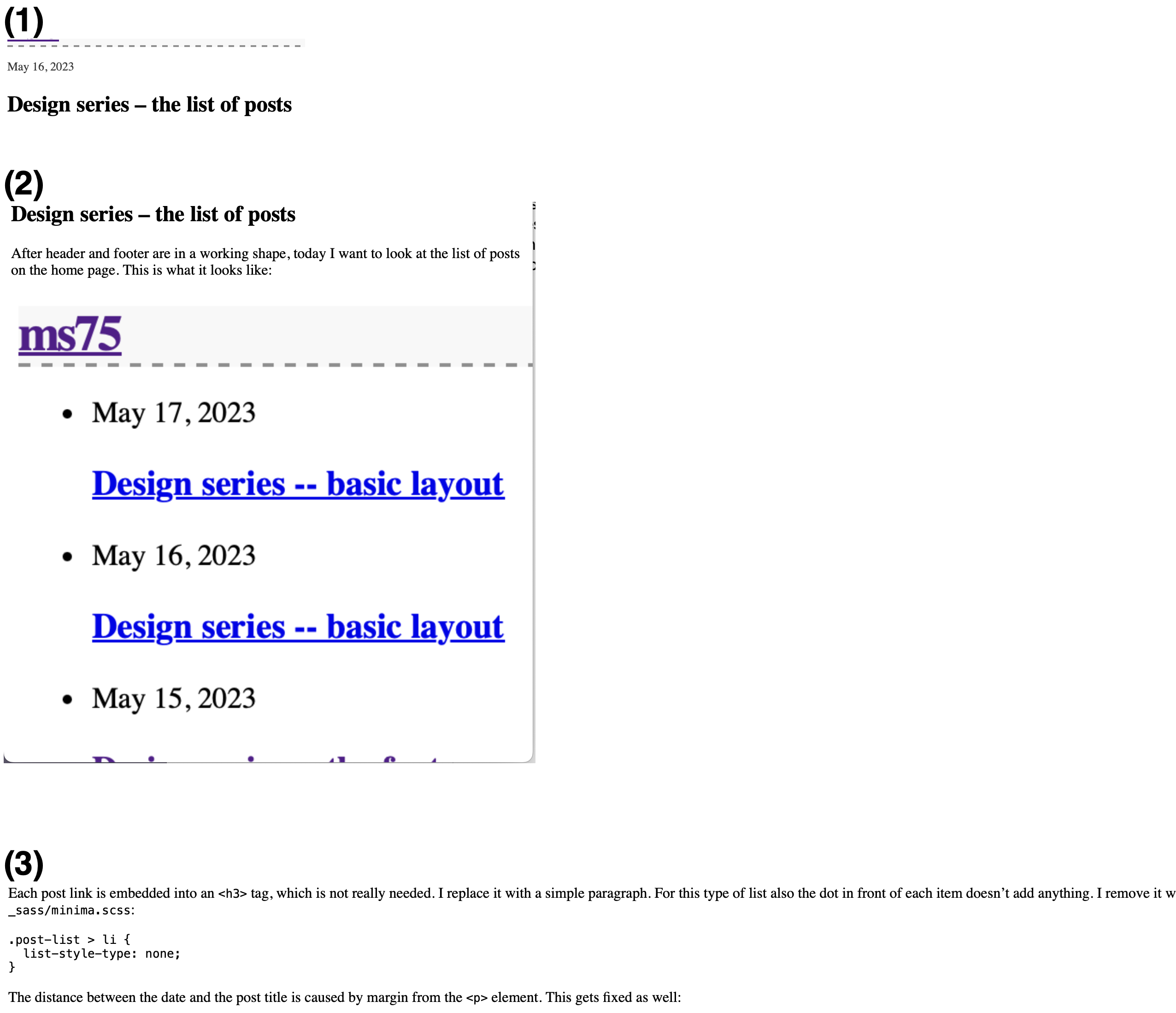
| Titles | The date is too far away from the title. | (1) |
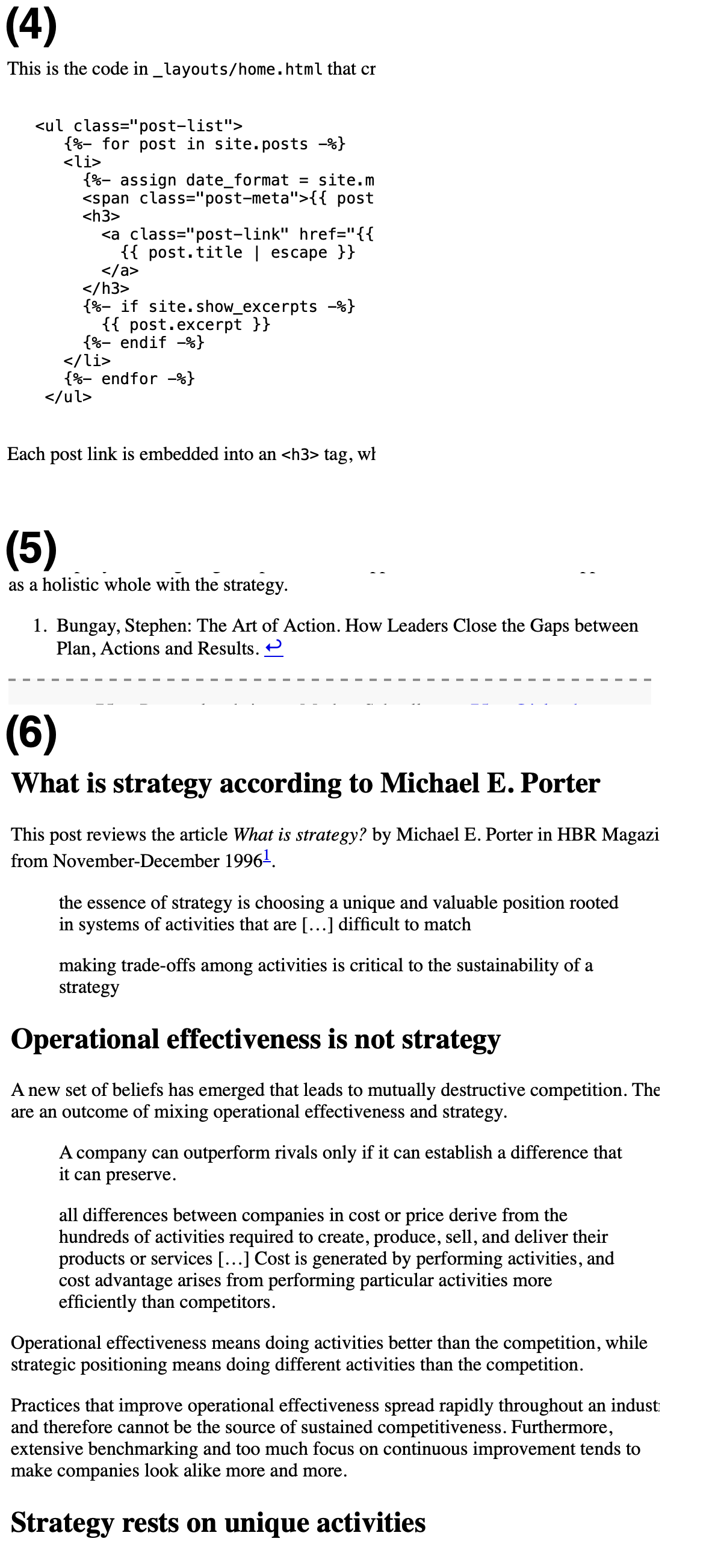
| Images | Images flow over (there are too big) | (2) |
| Body text | Lines get too long to read comfortably | (3) |
| Code blocks | Code blocks could stand out visually a bit more | (4) |
| Footnotes | Footnotes should be left aligned with the text (or put in the margin, if possible) | (5) |
| Headlines | Have the the same size as the title, but should be smaller, feel more like part of the text | (6) |
| Lists | I find the bullet point too strong visually | (7) |
| Quotes | Should be visually different from normal text | (8) |
| Tables | The header should be left-aligned as well | (9) |
Overall that’s not too many complaints :) Let’s address them in the following days.
Evidence