Design series – the list of posts
After header and footer are in a working shape, today I want to look at the list of posts on the home page. This is what it looks like:
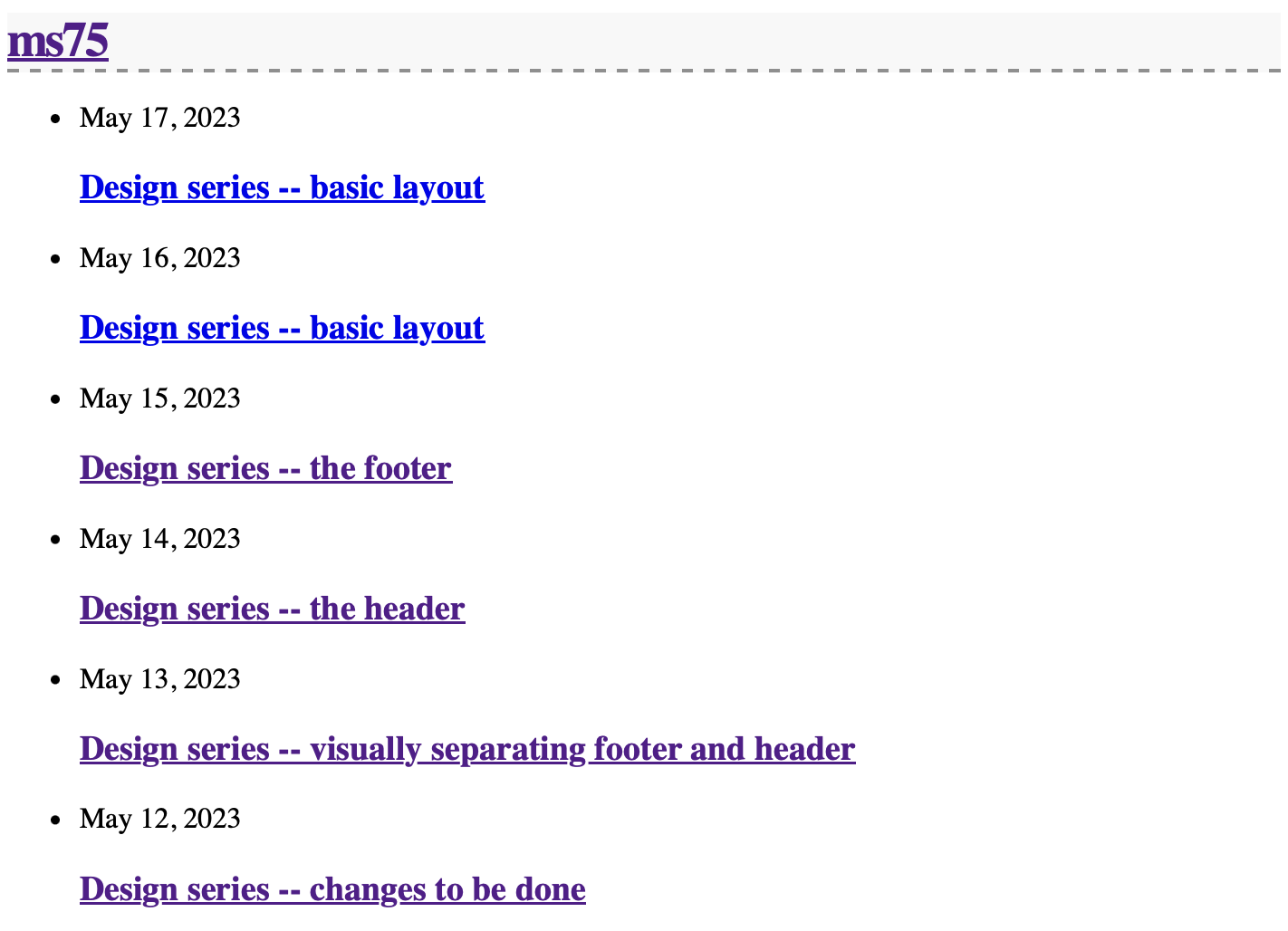
Here is what I don’t like about it. Or my thoughts about it:
The main element of the whole thing is the post titles. The Dates are secondary, and should connect.
- Dates and post titles are too far away from each other
- I can see only a few posts on mobile
This is the code in _layouts/home.html that creates the list:
   <ul class="post-list">
      {%- for post in site.posts -%}
      <li>
        {%- assign date_format = site.minima.date_format | default: "%b %-d, %Y" -%}
        <span class="post-meta">{{ post.date | date: date_format }}</span>
        <h3>
          <a class="post-link" href="{{ post.url | relative_url }}">
            {{ post.title | escape }}
          </a>
        </h3>
        {%- if site.show_excerpts -%}
          {{ post.excerpt }}
        {%- endif -%}
      </li>
      {%- endfor -%}
    </ul>
Each post link is embedded into an <h3> tag, which is not really needed. I replace it with a simple paragraph. For this type of list also the dot in front of each item doesn’t add anything. I remove it with the following piece of code in _sass/minima.scss:
.post-list > li {
  list-style-type: none;
}
The distance between the date and the post title is caused by margin from the <p> element. This gets fixed as well:
.post-list > li > p {
  margin: 0;
}
Now we can use the stack model from Every Layout on the post-list:
.post-list {
  display: flex;
  flex-direction: column;
  justify-content: flex-start;
}

.post-list > * {
  margin-block: 0;
}

.post-list > * + * {
  margin-block-start: var(--norm-size, 1.5rem);
}
Good. Next thing is to dim the date a bit and maybe make it smaller:
:root {
  …
  --secondary-text: #282828;
  …
}

.post-meta {
  font-size: var(--small-size);
  color: var(--secondary-text);
}
Almost done. The last thing is to also make the “subcribe to RSS” at the end of the posts a bit less prominent and also put it into the center, so that it is clearly separated:
.rss-subscribe {
  color: var(--secondary-text);
  font-size: var(--small-size);
  text-align: center;
}
(Or should the subscribe go to the real footer?)
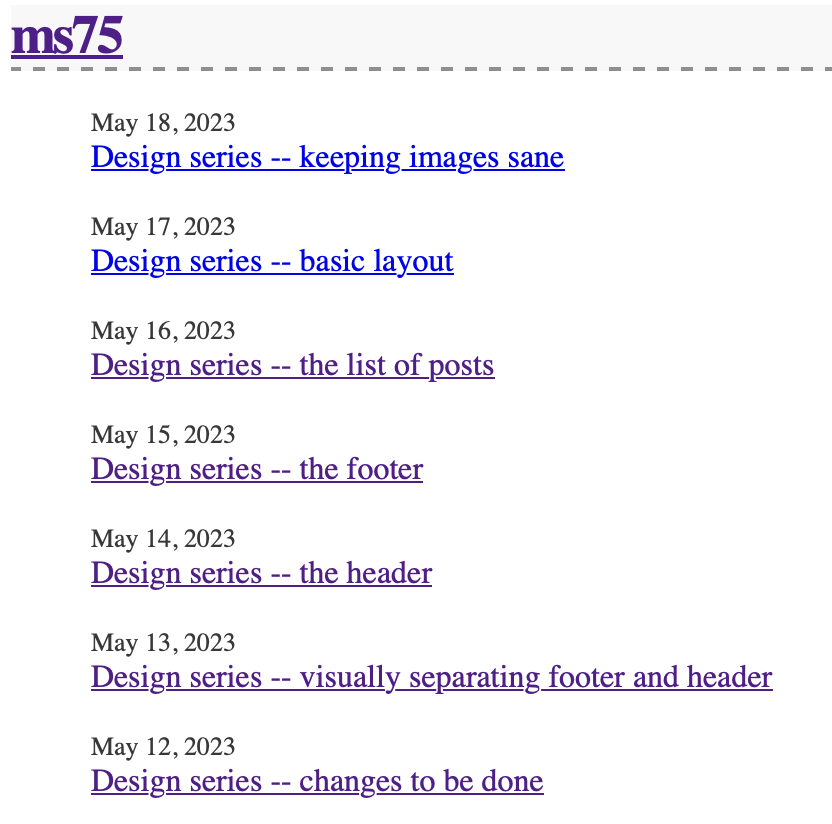
This is what it looks like now: